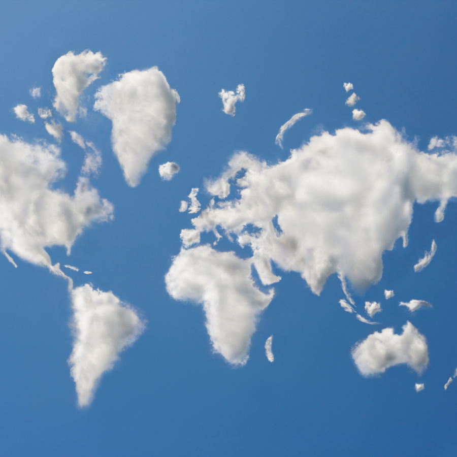
What makes maps fair?
Reading the title, you might wonder: "Are maps not fair, then? They are just presenting objective data, are they not?" Yes, but how those data are presented is not neutral, Dr Britta Ricker shows us in her lecture on critical cartography.
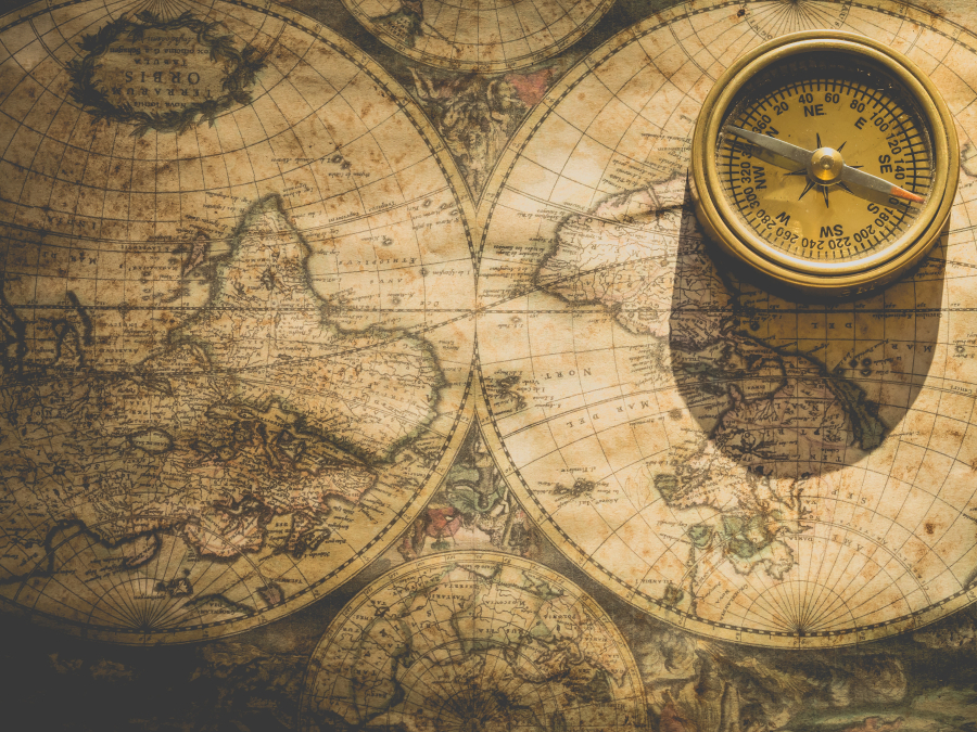
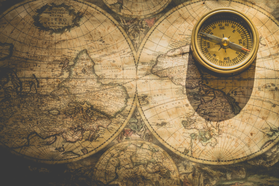
Take for instance the Waldseemüller map, the first map with the name 'America' on it, which Dr Marco van Egmond presented in the first lecture in this series. It has Europe at the centre. That was a logical choice for the mapmaker at the time: he was himself in Europe, and Europe was the centre of power. But by centering Europe, the map reinforces that power. The map also leaves out parts of the world whereof there was little information, or wherein there was little public interest, from the point of view of the mapmaker. So mapmakers make certain design choices, they select certain data to be able to highlight the information they want to get across, and they have to work with the data that are available to them. As a result, maps give direct as well as indirect messages.

Who is missing?
This means that when we look at a map, we have to ask ourselves a few questions: what is missing from this map? Who is missing from this map? Which design choices were made? How do I interpret this map? To illustrate, Ricker shows us a map of Cape Town. It's the kind of map typically used by policy makers and councilors to decide where the street lighting goes, or the school, or a library. Juxtaposing it to a map of Google Maps, you suddenly see that part of the map that seemed empty, is in reality not empty at all. As you can see below, there are townships there which are missing from the official maps. So the people living there are left out, not just out of the map but also out of the policy decisions concerning the area.
So what gets counted, counts.
See for yourself
Below you can see the Cape Town street map (the white lines) often used by policy makers. It is juxtaposed to a map of Google maps, revealing "hidden" townships. The townships are real, as you can see in the Google Maps view further below.
It matters who collect the data
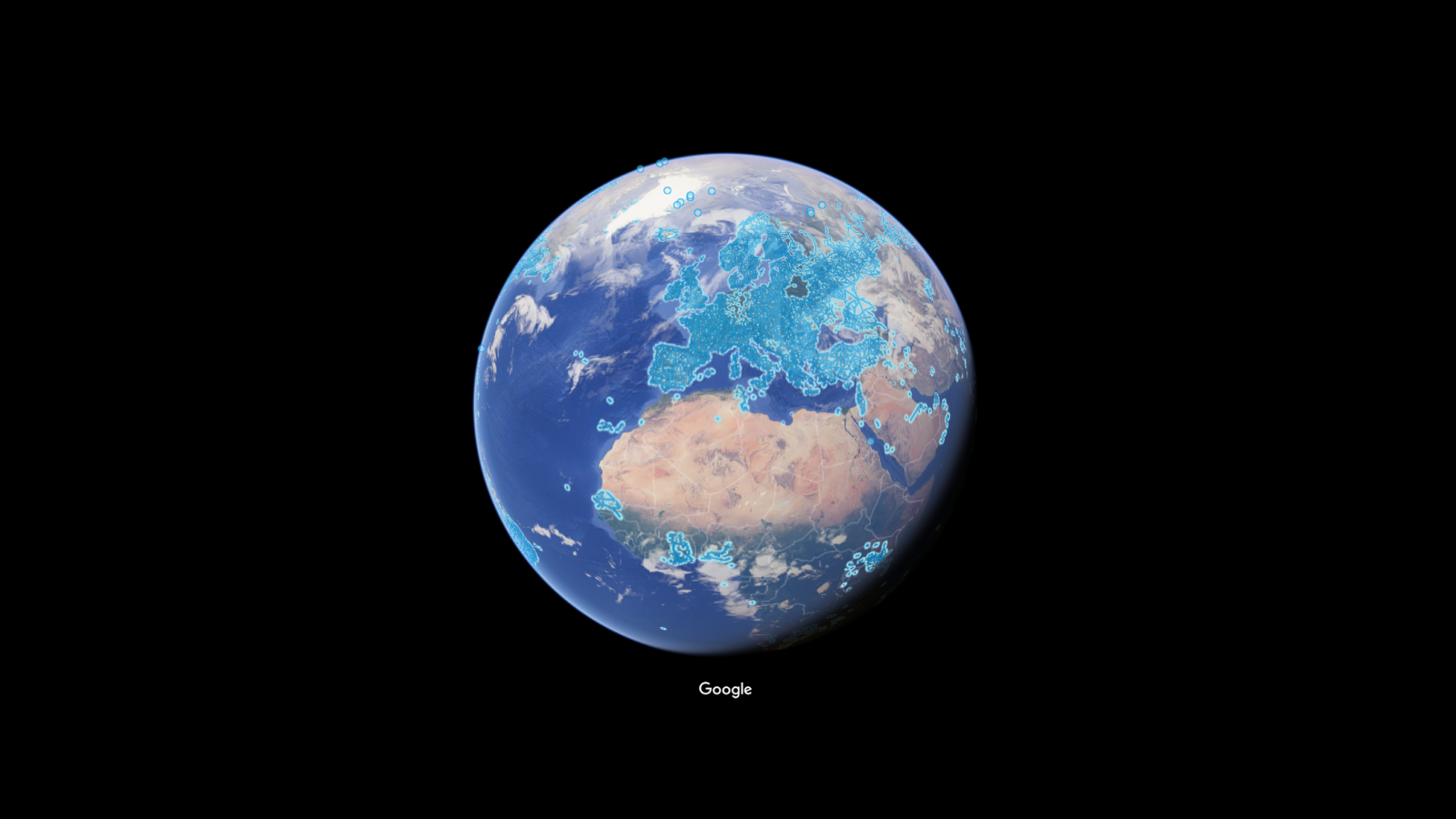
And becomes visible. If your business isn't tagged as such on Google Maps, it will not show up there, and your customers won't find it. It matters who the people are that collect the data the map is based on, and what they think is important. In Google Maps, there are seven different categories of 'adult entertainment', and only one category of 'child care'. Whoever these data collectors are, they are more meticulous about labeling adult entertainment than child care facilities. And if you look at Google Street View, you will notice that there is a very detailed street view mapping of Europe, but not of Africa. Africa seems empty. Only where Google chooses to collect data, the map is populated.

We can all add to the maps
But the good news is, we as map consumers have a role to play here. In Cape Town, NGOs help residents populate the map through the software of OpenStreetMap. This way, not only are residents of townships added to the maps and thus become visible to policy makers, they can now be helped to obtain deeds to their property, giving them official status that allows them to pass property on to their children, for instance. And after the earthquake in Port-Au-Prince, Haiti, Red Cross volunteers found that their efforts were hindered because so much information was missing from the maps. Within a few days, volunteers on the ground had filled in many of the blanks using OpenStreetMap. Google Street View data can be added to by locals, using local means of transportation suitable for the local circumstances.
What gets counted, counts
We can make maps fairer
So this is also the answer to the question at the beginning. What makes maps fair? It's us. We can make maps fair by adding to them. We no longer need experts to make a map, like the old map that introduced us to the word 'America'. We all have a phone and can add data to maps, using OpenStreetMap or Humanitarian OpenStreetMap. There are even mapping parties, organised for communities to contribute to open data helping the Sustainable Development Goals assess progress. This way, we can help diversify perspectives and producers of maps. And we can also, in reading map, ask ourselves: what and who was left out of this map? What was the map for? Who made the choices?